
BMIHMS
*
BMIHMS *
Brand: Blue Mountains International Hotel Management School (BMIHMS)
Project: Brand Identity
As part of my final unit in my Diploma of Graphic Design, I was tasked with doing a re-brand for a real-life client, being the Blue Mountains International Hotel Management School - a sub school of Torrens University Australia.
Located in the picturesque region of the Blue Mountains, in New South Wales, the school was seeking a new and modern brand identity to suit their aims of increasing enrollments and public perception.
The aim of this project was to portray an image of prestige and premium higher education, as well as emphasising Australia’s unique hospitality environment.
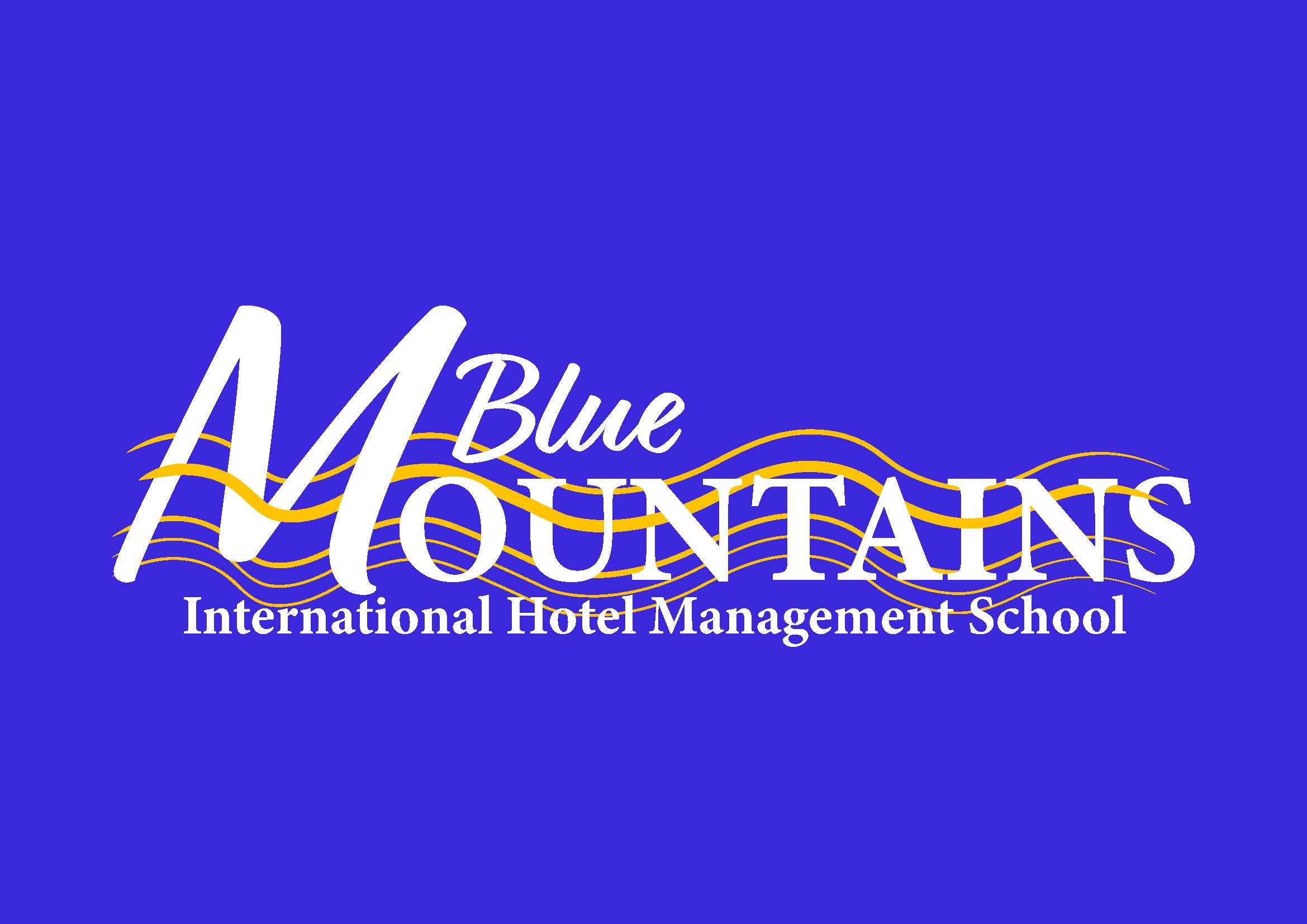
My aim as the designer for this project was to create a more youthful, modern and sleek brand identity for the school. I wanted there to be an element of fluidity in the overall design. In my final word mark, the notion of ‘blue mountains’ really shines through, with the fluid gold shapes in the background being a call-back to topographic and relief maps. The large ‘M’ could be almost reminiscent of a set of twin peaks. The yellow/ gold colour calls back to the high-quality service and ‘prestige’ the brand wants to emphasis through the logo.


As requested by the client, I created a course guide and a digital advertisement using the new branding identity. I provided the client with both mock ups and the design itself so they could better visualise the final product.

I created an Instagram account and Social Media identity for the school, as more and more companies have turned to online platforms to advertise their services. I felt it only fitting to also show a shift in promotional strategy.

Overall, this was a very rewarding project to work on, and I would love the opportunity to work on similar projects in the future.
